Story this post:
“Bull Market” (my title)
Story and art by Jack Cole
Smash Comics #73
(Quality Comics Group
Oct, 1947)
Left: Cover by Jack Cole
In his great 2003 essay on Jack Cole (Comics Journal #255), Jeet Heer observes that Cole’s stories in his 1946-47 period are more light-hearted than his earlier stories which feature grisly violence. Heer writes about Cole’s PLASTIC MAN stories, but his insight works just as well for Cole’s Midnight stories:
“The plots for the stories in this (period)… are very simple. They usually involve simply throwing Plastic Man and Woozy Winks into an odd environment (an old-folks home, the artic, a futuristic city) where they have to fight a gang of crooks, who often seem reassuringly incompetent.”
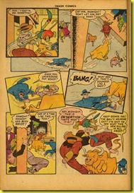
In the case of the story in this posting, the setting is the New Central Stock Exchange on Wall Street, a place Cole probably visited or walked by in the years he lived in Manhattan. This story can be seen as a partner of sorts to Cole’s previous MIDNIGHT story (read it here), which features a cow and a county fair. Cole changes the cow into a bull and moves the setting from rural America to the country’s most sophisticated city and the world of high finance. Jeet Heer goes on to write:
“What keeps this basic formula interesting is Cole's antic visual humor, which can be seen in the attention he paid to gait and body movement. The characters rarely walk from one spot to the next: they are always bouncing about, prancing, leaping or ricocheting. Because of his focus on the comedy of locomotion, Cole was always focused on getting his characters from one panel to the next, or moving from the top left to the bottom right of the page.”
I love Heer’s phrase: “the comedy of locomotion.” This story is a great example of Cole’s focus on depicting comic movement throughout his story. In virtually every panel, characters are captured in mid-movement. The drawings sometimes are as distorted and unlikely as the image you see when you press the pause button on your DVD player during a vintage Bob Clampett DAFFY DUCK cartoon.

Cole’s art in this period is quite spectacular. His splash page in this story makes creative use of stock market ticker tape in a composition that rivals the best of Will Eisner’s famous SPIRIT splashes.
Smash Comics #73 (Oct. 1947)
Sadly, these Midnight stories of Cole’s second run are woefully weak on plot. As wonderful as the art is in this story, it is awfully hard to follow. Cole is said to have created his stories by starting at the first panel and spinning the story out from there. Given this, it’s easy to see why he would lose track of the overall shape of his story, and become engrossed in the visual dynamics. Jeet Heer puts it very well:
“With his focus on panel and page design, Cole's characteristic unit of attention was much smaller than those cartoonists who labored to produce well-crafted and shapely stories (notably Will Eisner, Carl Barks and Harvey Kurtzman). Unlike these other pioneering comic book creators, Cole cared little for the pace and structure of his stories. Plastic Man's adventures tend to ramble haphazardly, starting with a strong momentum that usually dissipates with an abrupt ending.”
Everything about the storytelling in this episode is forced, and as result, the story is not much fun to read. As if sensing this, Cole would make a mid-career course correction in 1948 and enter into what could be called the baroque period of his work, with better-realized stories and a much greater profusion of background gags.


No comments:
Post a Comment