Jack Cole’s comic book stories stand out in part because of they often featured unique, brilliantly designed splash pages. Cole was a master of the art of the splash page, perhaps second only to Will Eisner. His opening pages contained more energy, more eye-candy, and more dramatic action than most comic book stories of the time had in their entire 6 or 7 pages.
Note: many of the stories connected to the splash pages shown in this article have been reprinted in their entirety in this blog. I’ve included links to the stories in this article, but you may also consult the Cole-Mine directory at right.
The term “splash page” refers to the opening page of a comic book story. Usually, but not always, the splash page is a page-sized panel filled with vibrant action and detail. Sometimes the splash page may contain a large opening scene and logo integrated into the first two or three panels of the story. The idea behind the splash page is that it draws the reader into the story with a splash, setting the mood and tone of the tale that it introduces.
While the origins of the term “splash page” are hazy at best, one can trace the adoption of this cornerstone of graphic storytelling in American comic books to around 1939-40.
The first comic books were reprints of newspaper comics. Since newspaper comics of the time were mostly limited to a full page at most, there were no splash pages. Sometimes newspaper comics had a splash panel, but usually the page was laid out in a grid, like these pre-historic comic book pages from New Fun #2 (March, 1935):
Note the narrow rectangular decorative header at the top of the page, followed by a first panel of text that introduces the episode and recaps previous story developments. These elements are the embryo of what would eventually become the splash page.
Comic books took off in a big way after 1935. Soon publishers ran out of newspaper comics to reprint and the demand for original material quickly soared. The first original comic book stories were made using the grid-like form of newspaper comics, such as this page by SUPERMAN creators Jerry Siegel and Joe Schuster from Detective Comics #1 (March, 1937):
Even though this is the first page of a four-page story, Siegel and Schuster employ the the same narrow header strip and grid approach as color Sunday newspaper comics of the time, However, Jerome Siegel and Joe Schuster were inventive young men themselves, and for their second story in Detective Comics #1, they delivered a very early example of the splash page:
Jack Cole came into comics around this same time, and his first work for Centaur follows the newspaper comic format, as did most of the material in the Centaurs of 1937-40. Here is one of Jack Cole’s first published comic book pages, from April 1938 (Funny Picture Stories V2 #7):
You can see the antecedent of of the splash page in the first panel of the above page. The scene shown in the first panel is connected to the scene that follows, but features a different character, the husband. The joke in the first panel, “wife insurance policy,” is funny on its own merit, but the first panel gains depth after the entire page is read. This is a more layered, sophisticated approach than any other strip in the book, and indeed than in most comics of the time.
Cole opens “Home in the Ozarks,” his four-page hillbilly epic that appeared in Star Ranger Funnies V2#1 (Jan, 1939) with a splash panel in the top tier. He cleverly uses the clothes hung on the clothesline, holes and all, to form the title. He uses logs, instead of lines to frame this panoramic entry into the wacky backwoods world of the Ozarks.
Jack Cole’s first adventure story, “Little Dynamite,” (Keen Detective Funnies #6, Feb. 1939) again claims the top tier for a less imaginative but considerably more dynamic opener:
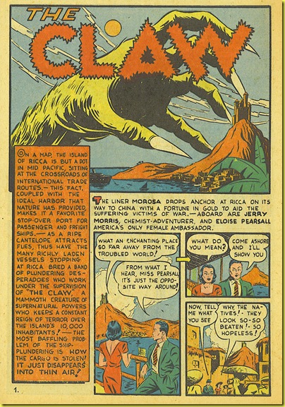
Published in December, 1939 (Silver Streak Comics #1, MLJ), Jack Cole’s first CLAW story opens with a splash panel that now takes up one third of the page. As with “Home in the Ozarks,” the splash panel contrasts an object in the foreground with a panoramic landscape view in the background.
The boldness of the CLAW splash panel is striking, suggesting the crushing grip THE CLAW has on the island. Note the lengthy introductory text in the vertical panel on the left. Cole’s early adventure/heroic stories often began with an unusual amount of narrative text. I think he was intuitively balancing out the immediate, visceral impact of the splash panel which can be grasped in a few seconds, with the depth of explanatory text, which takes a few minutes to read. The narrative opener is also a hold-over from the “story so far” openers of some adventure newspaper strips.
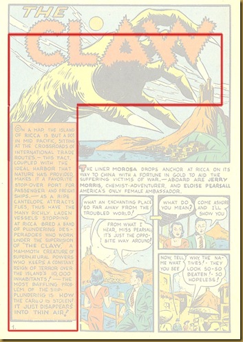
Most significantly, in THE CLAW splash above, Cole is moving towards his unique “reverse L” splash page, with the top horizontal and left vertical elements.
This “reverse L” layout appears in “California’s Kidnap-Murder Mystery” (Top Notch Comics #2 (Jan 1940, MLJ/Archie):
In this splash, very unusual-looking for the period, Cole has fully adopted his use of bold, multi-colored lettering of the series name, with the story title as a secondary sub-title. This was a device he would use in virtually all of his hundreds of comic book stories. Also, Cole has begun to work with the arrow shape as both a decorative element, and a design device for directing the reader’s attention.
Cole delivered one of his most dazzling reverse-L compositions in the splash page of his first COMET story, also published in January, 1940 (Pep Comics #1, MLJ/Archie):
Notice how Cole places his bold art elements: we start with a burst at lower left, lead up to the top, then arc across, down and back to the lower left in a loop. At the top of this loop, THE COMET literally bursts off the page. This is a brilliant layout; dynamism exponentially multiplied. You can’t NOT read this story!
Cole’s decorative lettering of the series name is bold yet stylish. Like so many of his contemporaries in early comics, Jack Cole acquired the ability to create exciting, eye-catching logo art – a special skill in itself, and a vital component of the comic book splash page.
The April, 1940 splash for “The Man With A Thousand Faces,” Cole’s long-forgotten but fascinating DEFENDER origin story, the one story of Jack Cole’s to be published in a Hillman comic) again has a strong vertical element on the left side:
In the left panel, Cole dramatically crops a close-up of a face in the foreground and creates a wallpaper effect in the background with a solid color overlaying line drawings of faces.
In the right panel, Cole arranges the elements of square and round panels with narrative blocks in collage-fashion, as it they were cut-out and placed on TOP of the black rectangle. His mid-1940’s work for Quality would often treat panels as if they were pasted on top of the page, tilted and with corners curling up.
Also in April, 1940, Cole published one of his finest splash pages in Pep #4 (MLJ), a masterful use of his “reverse-L” layout, this time with a downward thrust:
April, 1940 saw the first appearance and origin of yet another now-forgotten Jack Cole character, the Indian shapeshifter, Mantoka. This splash page from Funny Pages #36 (April, 1940 – Centaur) employs several winning design elements that would become a staple of Cole’s work: the use of bold, colorful patterns, vibrant logo art, and the dynamically tilted panel:
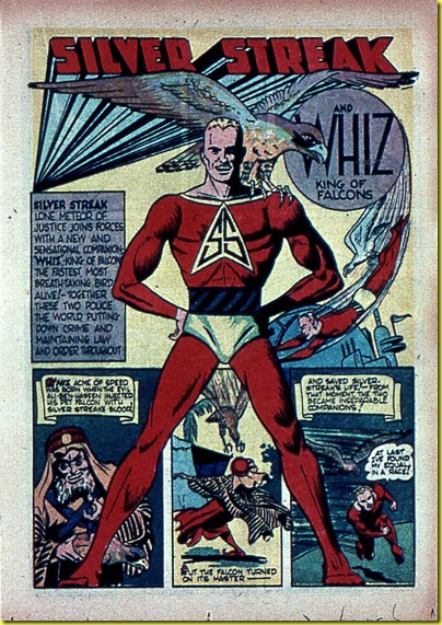
Cole’s first full- page splash appeared the following month, in May, 1940 in Silver Streak Comics #4. It is an iconic image of speed in the modern age:
This was his longest published story to date, signed by his pen name, “Ralph Johns.” Cole had graduated from 5 and 6 page stories buried in the back pages to an 11-page lead feature. For the first time, he had breathing space and room for the luxury of a full-page splash. Cole was also the editor of this Lev Gleason publication, and that didn’t hurt matters, either.
One month later, in Silver Streak #5 (June, 1940), Cole delivered another kinetic gem that is all about dynamic diagonals:
Cole presents the character of the Silver Streak’s “creator,” Ralph Johns in a heartfelt, boyishly enthusiastic introduction addressed to the reader. Speaking directly to the reader from the splash page would be a device that Cole would use continually throughout his career, although he would usually have characters address the reader instead of the “creator.”
In addition to the Claw/Silver Streak/Daredevil stories in the front of his comic book, Cole wrote and drew a wonderful, long-forgotten series about a boy inventor. In this splash, resplendent with fiendish glee, also from Silver Streak #5 (June, 1940), Cole once again employs the reverse-L layout:
Cole created a hallucinogenic full-page splash for Silver Streak #7 (August, 1940):
The above splash page suffers from a lack of cohesive visual design, a rare anomaly in Cole’s work. In addition to editing this particular issues, Cole created 38 pages of it, delivering four exceptional stories. Here’s another splash from the same issue (Silver Streak #7, August, 1940) that displays a stronger layout idea (this time, it’s an “X” instead of an “l”), but nonetheless suffers from a lack of polish”
Perhaps the task of editing a monthly book, filling a nearly a third of it with pages he wrote, penciled, inked, lettered, and most likely colored himself was taking its toll.
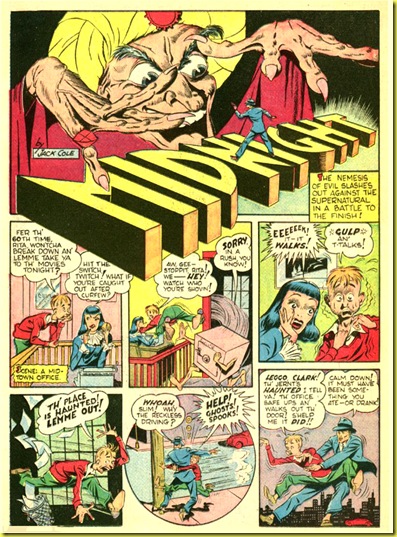
At this point in his career, Cole left Lev Gleason and Silver Streak Comics to work for a new publisher, Quality Comics Group, where he settled in for the next 13 years, the rest of his career in comic books. Smash Comics #18 (Jan, 1941) debuted yet another new Jack Cole creation, MIDNIGHT, introduced by a much slighter splash panel than his exciting Silver Streak extravaganzas:
At first, working at Quality meant Cole had to shift from the epic 12-16 page stories he had created for Lev Gleason to just five pages. This may explain the rather cramped, lackluster splash panel of the first MIDNIGHT story, above. Just three issues issues later, in Smash Comics #20 (March, 1941) , Cole’s splash panel work shows the first influence of Will Eisner and Lou Fine, whose brilliant splash pages were also appearing in Quality comics.
By the next month, Jack Cole had brilliantly adjusted to the 5-page format, and drew a supremely elegant reverse-L splash page for one of his greatest comic stories in Smash Comics #21 (April, 1941):
A key element in the success of the above splash is the limited color palette. By some accounts, Quality’s publisher, Everett “Busy” Arnold, handled the coloring chores himself. Said to have been color-blind, Arnold colored his comics with vibrating color combos and lots of red. In the above splash, Arnold either managed to transcend his limitations or another person –- possibly even Jack Cole himself – colored it.
Aside from the effective use of color, Cole’s choice of camera angles in each panel is particularly adept at creating both a flowing and interlocked visual collage. He’s also begun to use a mix of squares and circles in his composition, which add visual interest. The logo art is also very accomplished, with a strong, confident line and expert drop shadow. Cole’s choice of an archaic, older font for the logo art suggests the timeless quality of the tale that is about to play out: murder, a world thrown into chaos, and then the heroic restoration of balance and order,

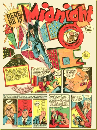
Cole’s MIDNIGHT splash page of a couple months later (Smash Comics #23, June 1940) is one of his more unique ideas – and that’s saying a lot when you are considering the work of the always inventive Jack Cole. In this case, Cole draws a bird’s eye view of Midnight sailing across the tops of skyscrapers, putting his “camera” in a totally unexpected location. The square rooftop of the building at lower left is cleverly employed as an introductory narrative panel.
The following month, in the pages of National Comics #13 (July, 1941), Cole designed a memorable splash page for his only story in the QUICKSILVER series. The attention-grabbing target icon is used to great effect in this splash. Once again, Cole is working out how to draw speed on paper in this terrific splash page. Note how the speed “tail” has the series’ tagline in it (The Laughing Robin Hood) and also leads you into the bottom tier of panels, starting the story. Cole’s drawing is very tight, and his inking is almost overdone.
Cole’s splashes were becoming more exciting and accomplished by the month. It all came together for Cole in his splash page for Police Comics #1 (August, 1941), introducing a new character:
Perhaps it’s the knowledge that this splash page introduces one of the great comic book characters and begins a collection of truly wonderful stories, but there is something so perfect about this splash page that it stands out as a landmark in the history of American comic books.
In contrast to his QUICKSILVER splash (above) published the previous month, Cole provides just the right amount of detail in the opening two-tier wide splash panel. It may be that his idea of a humorous, light-hearted superhero series suggested a simpler art style to Jack Cole. In any case, he crated a new amalgam of his early “bigfoot” style and the super-hero look of the day. This is a delicate, intuitive visual balance between realistic, representation drawing and comic exaggeration that no other comic book artist attempting to draw Plastic Man stories has been able to achieve. The “Plastic Man” logo art looks as though the letter were cut from sheets of rubber. Interestingly, Cole’s organic letters are very similar to the style of lettering used 25 years later, in the 1960’s psychedelic era.
As he did in the splash from Silver Streak #7 (above), Cole shows centers a large image of the character on the page. And what a face… a wide grin, curly black hair, red suit, and shades! He’s at once satanic and heroic! Plastic Man’s torso is set behind an introductory scene that is equally compelling, as Plas very literally demonstrates the long arm of the law. Plas and the crooks are standing on the panel border – a visual witticism that announces this is a self-aware comic book story, perhaps the first. The front view of the large figure beautifully sets off the side view of the small figures. This combination works so well that it is surprising that Cole did not use this layout more often. As an introduction to a new character, though, it can’t be beat.
In the next part of this article, we’ll survey Cole’s splash pages from 1942-48, a period in which he reached dizzying heights of comic art excellence!
All text copyright 2011 Paul Tumey








This is what comics scholarship is all about! Great work here! It's impressive how high a bar Jack Cole set for himself with the design and impact of these early splash pages. (I, too, would love to know the historical origin of the phrase 'splash page.' I assume it has something to do with the reader diving or jumping into the story. But who coined the phrase?)
ReplyDeleteBack to my comments... This is one of your best posts... really focused, strong writing and commentary, and a boatload of well-chosen illustrations.
I don't think anyone has written this extensively about the nature of the splash page before. I can't wait for the next installment of this series!
I'm in total agreement with Frank's comments. Another stellar Posting on the genius of Cole's design sense. With some genuinely insightful writing, by yourself.. Congrats!
ReplyDeleteI'm late to the party here, but thanks for the excellent post.
ReplyDeleteIt's a good thing few blogs have this level of
scholarship and fascinating analysis of the medium,
because if every comics blog was this good I'd never get any work
done.