Midnight 18- Midnight Goes to Hell
Story, art, lettering by Jack Cole
Smash Comics 36, Oct 1942 (Quality Comics)
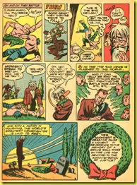
Here’s yet another Jack Cole story in which he explores death, to the point of actually killing off his hero and following him to the gates of Hell.
Jack Cole signed this story on the first page, a sure sign that he not only performed all the writing, penciling, inking, and lettering on this story, but also that he felt proud enough of it to affix his name to the finished product!
This story is certainly among the best of the Midnight series., and certainly one of the great Hell/Devil comic book stories (a sub-genre in itself) of all time. Bringing his character to Hell was great fun for Cole, who had a field day with his penchant for the grotesque in these pages.
Our story begins with a great opening page, followed by the wacky conceit of a car chase in which Midnight and the pursued crooks taunt each other using car radios! Perhaps they should have paid more attention to their driving…
Starting with a hot (if you’ll forgive the pun), splash page, this story delivers a wonderful brew of excellent design, great writing, and some of Cole’s keenest satire to date.
Cole loved to draw fire and flames. Many of his early stories shine brightly from the glare of monstrous flames leaping off the pages.
In Cole’s universe, Satan isn’t such a bad guy, after all… it’s the fiery red-head he’s married to that’s the real problem! Cole manages to make Satan’s wife look both shrewish AND sexy. It’s interesting to reflect that Cole, with his puritan, wholesome upbringing depicted Hell as a place where the misery could be traced to a woman. Notice how her hair resembles fire, a great design touch. Also that her dress is green… the traditional complimentary color for red-heads. I’m guessing that Cole had a hand in the coloring of this story, as well. Midnight’s cool blues work in contrast to the warm reds and oranges of Hell.
By the time Cole created this story, World War Two was in full swing. Hence, the topical reference to the Nazis.
Cole prefaces the story on the splash with an admonition not to take the story seriously, supposedly letting us know this is an imaginary tale outside the continuity of the series. But it matters little, since Midnight is actually brought back to life by a mysterious stranger.
Cole uses this mysterious stranger as a way of linking this story with the next, a device he would also use again in Smash Comics 38. For now, you can read the “sequel” to this amazing story – a story that is perhaps even more wonderful than this one – here, in an essay written several months ago looking at how Cole depicted speed on paper.


Seeing these page thumbnails side by side, I'm struck by how crowded most of the page layouts are.
ReplyDeleteThe panels in the four-panel tiers are narrow enough that after the word balloon is included there are a lot of head-and-shoulder shots and little in the way of backgrounds.
This is a lot different than the Plastic Man story you feature in your next post, in which you can really study a single panel and spend a lot of time savoring the details (the MAD-like "chicken fat").
The previous Midnight story (the one with the movie starlets) was similar in its use of four-panel tiers, but the one before that (the swamp story) had really wild layouts with comparatively huge panels.
Is there a pattern or trend to Cole's comic book page layouts?
Constantine,
ReplyDeleteThank you for your thoughtful and observant comment.
In 1941-2, Cole was growing rapidly as an artist and experimented a lot with his layouts. Of course, you can see this experiementation happening in his pre-Quality work too... such as in the great Crime on The Run splash pages, or in the THE COMET stories, which we have yet to explore in this blog! Cole's first Quality stories were pretty dense in their layouts. This coudl be due to the fact that he had so few pages in which to tell his wild, action-packed yarns. As his page count per story number expanded (eventually Plastic Man got 15 pages, which was more than Superman or Batman at the time!), his layouts tended to settle down.
I also think Cole must have been influenced by Eisner's comics of the time, which also had 4- and 5-panel tiers.
After the mid-1940's Cole's layouts begin to adapt themselves to the needs of the story... using narrow panels to denote fast movement and small units of time, and larger panels to show larger units of time.
One layout he used throughotu his career, and which seemingly only Cole could make work, was the narrow, full-height panel on the left. You can see this in some of the 1939 COMET splashes and then used in a 1949 Burp the Twerp reprinted here in this blog.
I think Cole innovated a couple of layout devices that were picked up by several of the Quality artists... including the tilted panel, and the circular panel. Check out the Bob and Swab stories I reprinted in this blog to see an example of how Cole as a designer and layout artist influenced others. Cole was a considerably gifted designer and there is much to learn by studying his layouts.
Thanks again fior writing.