When you look at pages by a master such as Jack Cole in black and white, you somehow get closer to the art, and the artist’s intentions. You see the page as the artist saw and worked on it. When the artist inked his pencils, as Cole so often did, you can also more easily see and appreciate his careful line work and collection of techniques for rendering textures, shadows, and forms.
Since it appears that no original art for any of Jack Cole’s comic book work is in circulation, there are scant opportunities to study his line work without color.
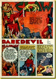
Here are two Jack Cole stories, originally published in color and here reprinted in black and white.
The first comes from Golden Age Greats #10 (AC Comics, 1996). I’m not sure how this publisher derived black and white pages from the original color pages. Perhaps they used a process called Theakstonizing (after comics historian and restorer Greg Theakston), which uses chemicals to leech the color from printed pages. The story could be traced, as well. The art has clearly been retouched, as grey tones have been added. Perhaps the story is simply nicely Photoshopped. In any case, it’s a treat.

Here’s the story, originally published in Silver Streak #10 (April, 1940):
What a wild ride! Whew! This story is the last of Cole’s CLAW stories, a series he created for Lev Gleason and the first true signs that comic book stories by Jack Cole are something special.
Although the first CLAW stories were straight-ahead, deeply sincere hero stories, by issue 10, Cole has begun to experiment with the winning combination of superhero and humor that would come to define much of his comic book work in the 1940s.
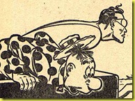
The perfectly timed sequence at the end of page two (the set-up) and the start of page three (the punch line) is sublimely startling. We see the form of a shapely woman (another classic Cole motif making an early appearance here) and assume that she is no doubt THE CLAW’s next pitiable victim. However, our expectations –- created by the already worn-thin clichés of pulp magazines, adventure books, and even comic books – are delightfully thwarted as the beauty is shown to be wearing fake buck teeth. This mix of dread and humor, female beauty, and pranksterism all wrapped up in a satirical sequence that goes by in the blink of an eye is classic Jack Cole.

I’ve written extensively in this blog about Jack Cole’s core theme of shapeshifting, most often manifested by face-changing. These two early humorous sequences are variations of Cole’s core theme.


Another technique that pops out in this black and white version is the way Cole draws stone walls. Simply filling in the numerous blacks in the above two panels must have been very time consuming., Incidentally, this very technique also shows up the early 1940s SPIRIT stories.
In all, even though Cole at this stage of his career is hardly an expert draftsman, and his anatomy is often awkward, we see the young artist putting in inspired touches at every opportunity.
To compare, here is a story from about 10 years later, from Plastic Man #30 (July, 1951). This was a period where the comic book industry in general was shifting from all superheroes to other genres, and in response, Jack Cole (as well as many other comic book artists of the time) adopted a new, more “realistic” and toned down visual style.
The story itself is pretty awful, and not one of Jack Cole’s best efforts, by any means. Reading this particular story, it is hard to see why anyone would rave over Cole’s work. Still, it is interesting to study the artwork itself, laid bare in black and white.
T
The presence of a Plastic Man story in this black and white book suggests the art was created from the originals, or perhaps photostats. Thus, even though the story is nowhere near Cole at his best, it is perhaps the closet thing we have to being able to look at un-retouched original art from his Plastic Man work.

It’s possible that Cole’s pencils are inked by another artist, here, but it’s my best guess – drawn from hundred of hours of study of Cole’s work – that Cole penciled and inked this story himself.
Cole’s post 1950 Plastic Man stories shifted from brilliant, over-the-top baroque cartooning to a shadowy and disturbing style that, in its own way, is just as brilliant as anything Cole ever did. What we have here, is an example of a story from the beginning of that transition.
Here, we see Cole stretching Plastic Man less. In fact, Plastic Man’s body is often awkward and ungainly, perhaps reflecting how Cole – a tall, shy man - may have felt.
At first, one is tempted to dismiss these clumsy images of Plastic Man as the work of another, less skilled artist. I could be wrong, but to me, this is Cole all the way.
Much like Jack Kirby found a way, in his early FANTASTIC FOUR stories (which had a stretching man character) to both tone down the imagery and root it in a world that has a more direct correspondence with our time and culture, so Jack Cole was working to mature his style and character. In short, Plastic Man is growing up in these stories.
The exuberant but simple work of the 1940 CLAW story has evolved into a world where the fantastic characters are weighted down with worry, responsibility, and fatigue. And, in a few months, Cole would invest his characters with dread and terror.
In all of this, Cole delivers some criminally underappreciated wonderful drawings. For example, it is worth spending some time to study this tier of panels:
First off, the placement of figures and composition is masterful, constantly leading the eye from left to right. Second, the expressions on the woman villain’s face reveal a great deal of human emotion; in this case, annoyance. Contrasting with the representational figure and facial expressions of the woman is the cartoony Woozy. In the middle panel, his facial expression is pure “bigfoot” cartooning. Somehow, Cole makes the two visual styles work together naturally, even organically. It’s easy to dismiss Cole’s later work as being uninteresting visually, but a closer examination reveals layers of depth.
In ten years’ time, with thousands of pages under his belt, Cole had become an ace draftsman and inker. I, for one, have come to greatly appreciate the craftsmanship and mastery of this period of his work. Check out, for example, the expert inking of the striped suit in this panel:
It’s nothing short of marvelous how Cole gets the effect of a fold in the suit arm not with the usual slashing brushstrokes that almost every other artist of the time employed, but with a clever displacement of the striped pattern. (One way to tell this story is Cole’s art is to observe the loving use of patterns throughout).
One can also appreciate the strong individuality of the face of the man in the striped suit. Look at the mix of straight and curly hair, the slouching head, and the wattled neck flesh. This is no Chester Gould style bizarre villain, but more of a Daniel Clowes character -- fascinatingly ugly and unflinchingly honest.
It could be observed that, as a writer, Jack Cole lost a great deal of steam after 1949, but it’s clear that the level of craftsmanship in his visual art, and his inventiveness as a powerful stylist continued to evolve and improve right up until the abrupt end of his life.
In looking at Jack Cole’s comic book work in a couple of rare black and white examples, one comes away with an even greater appreciation of the artist’s massive talent and deep commitment to his craft.
All text copyright 2010 Paul Tumey


