Sep 12, 2011

There was Playboy and also... The Army? Jack Cole's Unknown Comic Strip

Playboy Magazine's great cartoonist of the 1950's, Jack Cole, wrote and drew a great, sexy, Playboy-like girlie comic strip called Millie and Terry... and almost no one knows this!

The comic was published in a Sunday funnies format for a  package syndicated by W.B. Bradbury Co. called American Armed Forces Features. This was an 8-page color newspaper that was available at stores on US military bases. The comic section included Al Capp's Dick Tracy parody, Fearless Fosdick, and several Sad Sack type strips. Cole's cartoon - the best one in the lot -- was the only sexy, girlie, pin-up comic strip in the paper.


 Jack Cole's first published PLAYBOY cartoon was in the April, 1954 issue. His last comic book story was dated two months earlier, in February 1954. This was a turbulent period in Cole's career, as he left comic books after a 16 year career. At the time, in the early 1950's, the American comic book industry was imploding due to changing public taste, and the widespread (and incorrect) perception that comics were corrupting children. Comic book artists who had paid off mortgages and raised families on their work were scrambling to make ends meet. In 1954, Cole had a very brief stint of 3 weeks at Charlton (I have yet to locate any published work of Cole's at Charlton). He probably contracted with Bradbury for the Millie and Terry strips, spent a week writing and drawing a batch of perhaps 5 or 10 episodes. As the Millie and Terry strips were published monthly, Cole moved on to other magazine markets. Very quickly, of course, he found steady work with Hugh Hefner as PLAYBOY took off.

It may very well be that there are several undiscovered Jack Cole cartoons (perhaps even comics!) from this 1954-55 scramble for work. In fact, here is the cover to Army Laughs #9 (Dec 1954/Jan 1955), another Army gag magazine that, according the eBay seller, has at least one Jack Cole cartoon in it:


Earlier, I posted a Millie and Terry comic at this posting. I am indebted to my pal and fellow comics historian, Frank Young (see his great comic blog, Stanley Stories), for discovering this unknown Jack Cole comic, which he found tossed out in someone's trash. A wonderfully kind soul posted a very informative comment about this strip that gave me information to locate another issue of this rare, virtually unknown comic section... and so, I proudly present to you a second installment of Jack Cole's great "lost" comic strip, Millie and Terry!


Millie and Terry  - November, 1955 - American Armed Forces Features #9

Isn't this great stuff? I love the the opening drawing, of the two women curving together. This sensuous image can be appreciated separate from the narrative, and reminds me of the Females By Cole series that became a staple in Playboy Magazine. Cole truly had a gift for drawing the female form!

The gag in strip is genuinely funny, and the drawings manage to be both cartoony and graphically sophisticated at the same time. By this time, Cole had written and drawn about 600 similar one-page filler strips for Quality Comics, so he had the pacing and style of the "short form" of the comic strip very well worked out.
Now that we have two installments of this strip, which I believe had at least 10 episodes, we can see that it really is a sort of missing link between Cole's sexy Playboy work and his 1958 nationally syndicated comic strip, Betsy and Me (personally, I prefer Millie and Terry). The drawing style Cole uses in Millie and Terry is very similar to the style he would use in his comic strip about a comically overwhelmed new father. Here's a couple of examples, to compare:

Betsy and Me - July 13, 1958


Betsy and Me - August 10, 1958

Betsy and Me  has more graphic invention, but we can see the similarity in character design. In the call-out below, a face from Millie and Terry (on the left) has a very similar rendering, facial expression, and head-tilt to a typical figure from Betsy and Me (right):


Cole is also using some of his tried-and-true techniques that he brilliantly employed in PLASTIC MAN and his other comic book work, including the artful use of fabric patterns. Terry's blouse has bold stripes, while Millie's dress has a tasteful polka dot pattern. Note that the dress is colored green, which makes it very similar to the blouse worn by Plastic Man's sidekick (and perhaps Jack Cole's most brilliant character), Woozy Winks:


This suggests that Cole may have colored this strip himself. One can also appreciate Cole's artistry and attention to details when you realize that his polka dots for Woozy's blouse are perfectly round and all the same size, suggesting a clown's costume. Millie's dress is less garish and comical, with more delicate dots of varying size and shape. Crass versus Class; both are funny. Cole put a great deal of thought into his seemingly simple cartoons, and this is just one example of that!

Jack Cole's work is filled with terrific women's outfits. In a Comics Journal interview with a fellow golden age comic book artist and colleague of Cole's, Craig Flessel relates: "(He was) very much in love with his wife. He bought all her clothes. He worshipped her. " Perhaps Cole's knowledge of women's outfits came from his clothes-buying trips for/with his wife. It's  charming to imagine the shy, quiet, tall and lanky Jack Cole in a ladies' wear store secretly taking mental notes for his comic book stories!

As more examples of Millie and Terry surface, I will share them in this blog!

Text and scans copyright 2011 Paul Tumey

Sep 7, 2011

Jack Cole: Colorist - Rare Golden Age Original Art (1941)

You just never know what you'll find when you troll the Web. This image has been up on Comic Art Fans for 5 years, but I just now discovered it! Sheesh! Many thanks to the site, and the art's owner for sharing this extremely rare piece! This is very likely the ONLY known page of 1940's superhero art by Jack Cole known to exist. It's the splash page from Silver Streak #10 (Lev Gleason, May 1941).
Note the "Good Luck" at the bottom. Could that be a note of encouragement to an aspiring comic book artist from Jack Cole himself? It's known that many comic book artists of the time gave pages of their original art to young visitors and fans as gifts. 

Even more interesting is the fact that this page is hand-colored, presumably by Jack Cole himself. Did Cole, before sending this page in the mail to a fan, perhaps take an hour or two and apply some color? I have long suspected that Cole colored at least some of his stories. He liked to do everything on his stories, if possible, from writing, penciling, and inking... and probably in some cases, coloring. At any rate, this page -- if it was colored by Jack Cole -- provides a clue as to the sort of color palette Cole preferred (at least in 1941!). 


A side-by-side comparison of Cole's coloring and the published version  (above) reveals that Cole had a more interesting palette, and a very different vision of the visual impact of the art than what was published. The published page has a lot of red and yellow... more garish primary colors. It is also interesting to note that, while the published page's splash panel treats the US map background as merely a non-distinguished field of light orange, Cole gives it a lighter color, making it an art element in the composition. It must have been frustrating for Cole and other artists of the time to create layouts and have the impact of them reduced by slapdash coloring. 

I've read that most of the stories at Quality Comics, Cole's main home for most of his career in comics, were colored by the color-blind publisher himself. 

The Claw vs. Daredevil story is pretty cool, by the way. We've published it on this blog in black and white, but since we are looking at color... here it is -- in its amazing, bizarre entirety in full, glorious (if sloppy) color, from a recently surfaced nice paper scan. Enjoy!


Sep 6, 2011

New Jack Cole Quality One-Pagers

Jack-Cole-caractoon-characters-reading-newspaper Jack Cole created hundreds of genuinely funny one-page comics for Quality Publications in the 1940’s. In these one-pagers, Cole loved to play with double-meanings and the surreal images that resulted. In many ways, they are an extension of the gag humor style Cole based on the newspaper screwball strips, such as SMOKEY STOVER by Bill Holman (see my post on Holman’s influence on Cole here).

Part of Cole’s greatness was that he married the screwball “bigfoot” humor style and the 1940’s comic book superhero into stories that were both thrilling adventures and surreal, wacky comedy. In his Quality one-pagers of the 1940’s, you can see Jack Cole at his loosest, most fertile. He often warmed-up to his longer comic book stories by knocking off these one-page delights. Sometimes the gags are flat, sometimes the humor is too bizarre, and sometimes Cole’s pacing and art is just too sloppy to make much of an effect.

Jack-Cole-cartoon-characters-with-eyes-bugging-outBut sometimes, and more often than you’d reasonably expect for a guy carrying the creative workload Jack Cole had in the 1940’s, these tossed off one-page fillers that were buried in the back pages and which never really earned Cole much attention (or money) at all – are flashes of brilliance.

Here’s a few one pagers that are new to this blog, mined from new scans that have surfaced lately. Many thanks to the original scanners.

Hit Comics 22 (June, 1942)
A very typical Jack Cole comic of the early 1940’s, with humor wrapped a core of sadism. I really like the looseness of the art.Probably due to the fact that Cole had very little time to work on these pages. At this time, Cole’s PLASTIC MAN was taking off, and he still had his MIDNIGHT duties, as well as the several other one-pagers like this one he produced for Quality Publications every month.
Hit 022-32


Hit Comics 26 (Feb. 1943)
A great example of Cole playing with words and generating a bizarre, surreal image as a result.
Hit 026-42


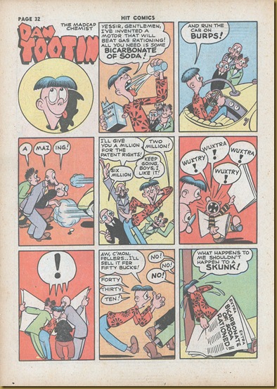
Hit Comics 27 (April, 1943)
Cole’s style just gets looser and more assured. Look at the beautiful figure groupings. The three figures in panels 3 and 4 are grouped as one. Then, in panel 5, they separate as they compete with each other in bidding for Dan Tootin’s new, delightfully silly invention. In panel 7, they are once again grouped into a cohesive whole with Dan as they all take in the new, game-changing information at once. Beautiful pacing, great drawing. By 1943, Cole had mastered the semiotics of comic book storytelling.
Hit 027-32


Hit Comics 34 (Winter 1944)
Notice how Cole’s drawing style has changed from the 1943 page, above. The drawing is tighter, more angular. The content is also edgier, not as innocently silly. And, sadly, here is yet another reference to suicide. It’s worth noting that the image of the weeping man, with giant teardrops gets developed a year later in a Spirit story, and then eventually leads to one of Cole’s greatest stories, “Sadly-Sadly” (see my post here)
Hit 034-18


Crack Comics 49 (July, 1947)
Cole’s style, by the mid-to-late 1940’s had become quite baroque, and this one-pager is a great example of that. A more complex page-layout, the use of patterns, background detail, multiple characters, the list goes on. Cole is juggling a lot of balls by this time. This story has enough content for a 5-page comic. The drawings feel very much like the figures in Harvey Kurtzman’s HEY LOOK one-pagers (which were very likely inspired by Cole’s Quality one-pagers.) The story also feels a bit like Carl Barks’ UNCLE SCROOGE morality tales about money that would surface a couple of years later.


Candy 12 (October 1949)
The master at work, with a variation on Mark Twain’s classic story, “The Celebrated Jumping Frog of Calveras County.” Once again, masterful figure grouping. This time, it's an accumulation of figures. As the page progresses, more and more figures are added to each panel, until we have a big clump in the last two panels. I suppose something could be said here about Jack Cole unconsciously exploring group dynamics, but it won't be... he created these things for a grin and a giggle, and that's exactly what I hope you'll get from this post!
candy_12_Oct1949
Related Posts Plugin for WordPress, Blogger...